It’s impossible to go 5 minutes in the PR and Comms industry without hearing the word ‘content’. It’s what we do and what we generate. One of the most powerful, digestible, and shareable forms of content is an infographic. If a picture paints a thousand words than an infographic can turn an excel spreadsheet of research data into the Sistine Chapel……(or at least a really nice drawing).
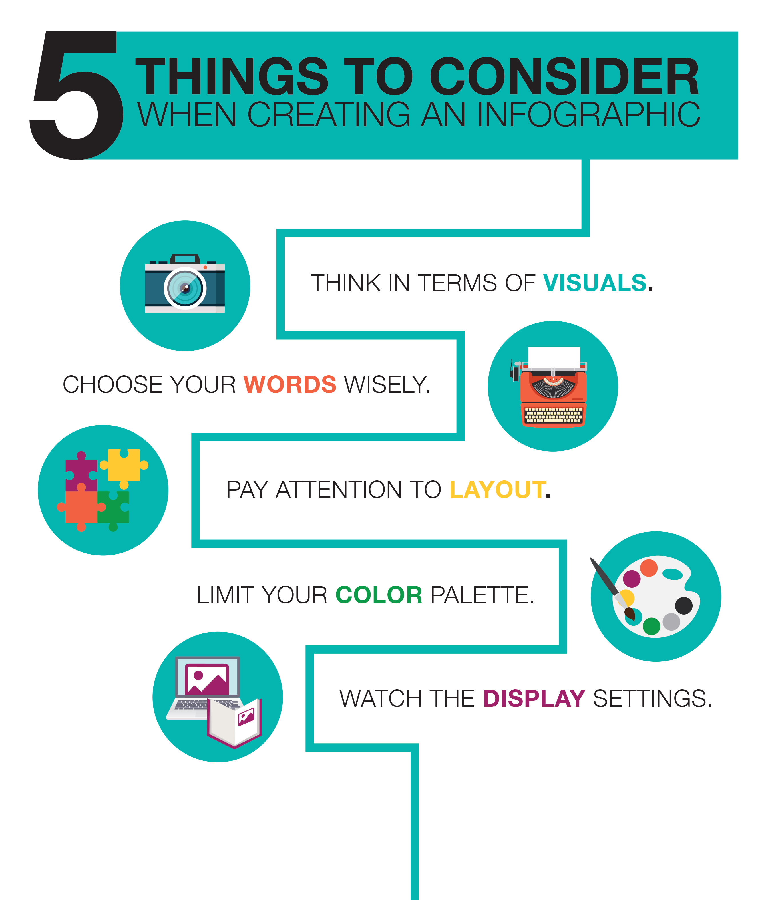
As you’ll know from the little flags in the corner of our site, we’ve got offices on both sides of the globe. They’ve condensed everything you need to think about when creating your infographics into a hand 5 step system which you can read for yourselves below:
1. BE AWARE OF THE DATA SEGMENTS AND WHAT THEY HAVE TO OFFER VISUALLY.
Comparison stats can be great for translating into graphics. The ability to visualize a statistic such as ‘x% of people prefer SUV’s over Minivans’ goes over well for visual storytelling purposes.
2. WORDING CAN AFFECT A LOT.
Be conscious of how statistics are worded compared to the space available within the infographic. Word segments that are too long can detract from the flow of the document and give it an awkward feel.
3. CHOOSE A COLOR SCHEME.
A sound color palette is vital. If the colors are harmonious, it will likely hold a viewer’s attention for longer. Avoid using a bunch of random colors in the infographic because they can be overwhelming and confusing to the reader. Instead, try using a set, limited color palette for the best results. A bunch of random colors is confusing and overwhelming, and the same rule applies to using too many fonts.
4. PAY ATTENTION TO LAYOUT.
When translating a bunch of stats into an infographic, always try to make sure the images fit together. Having a good visual flow in the document will keep the reader’s eye moving and is inherently more pleasing and engaging to look at.
5. WATCH THE DISPLAY SETTINGS.
One of the biggest things to take into account is the format that the PR research infographic is intended to be displayed. Print can be fairly forgiving, as it can be translated into nearly any size or shape; however, if you plan on your PR Survey Infographic to be digitally housed, aim for them to be user-friendly. Graphics that are too small might be hard for consumers to read, while documents that are too long can mean scrolling to get the full scope of the content being presented — both run the risk of losing the reader’s interest.

As with all brand-building efforts, the goal is to surround your consumers with positive experiences through carefully thought out research and engaging storytelling. Want to know more about getting the most out of your recent PR research? Need to conduct a meaningful PR research for your brand? We’re here to help!
